In the early 1980s, on the pages of academic design journal Visible Language, a classic thesis-antithesis-synthesis played out around the technological and philosophical fine points of computer-assisted type design. Stanford professor Donald Knuth begins with his article, “The Concept of a Meta-font” (Winter 1981). Two years prior, Knuth had conceived and programmed MetaFont — a software that enabled users to generate unlimited numbers of fonts by controlling a limited set of parameters.
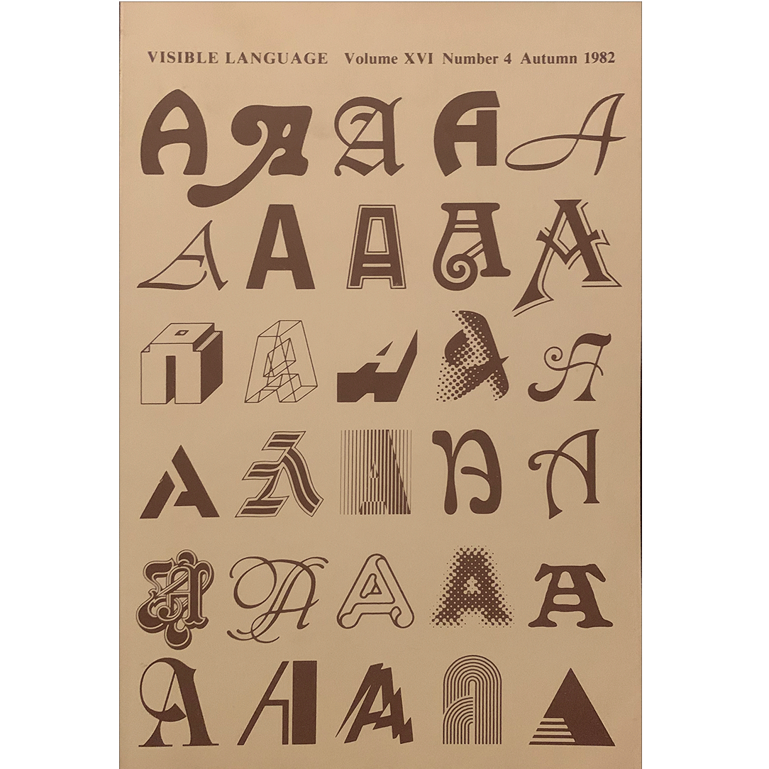
The article is a performative account of his intervening attempts, using MetaFont to harness the essential “intelligence” of letterforms. In Knuth’s view, the way a single letter is drawn—an a priori A, say—presupposes and informs all other letters in the same font. This information can be isolated, turned into a set of instructions, and put to work computer-auto- mating the generation of new characters by filling in the features between two or more variables such as weight or slant.
Such intelligence is (and has always been) implicit in any typeface, but Knuth is out to omit all ambiguity and install a more definite system. He acknowledges that this preoccupation with designing meta-level instructions rather than the fonts themselves is typical of the contemporary inclination to view things “from the outside, at a more abstract level, with what we feel is a more mature understanding.” From this elevated vantage, MetaFont was set up to oversee
A year later, fellow mathematician Douglas Hofstadter responded with his “MetaFont, Metamathematics, and Metaphysics” (Autumn 1982). While “charmed” by Knuth’s thesis, and admitting the bias of his own interests in artificial intelligence and aesthetic theory, Hofstadter proceeds to shoot down his colleague’s apparent claim that the shape of any given letterform is “mathematically containable.”To support his case, he invokes mathematician Kurt Gödel’s Incompleteness Theorems, which assert that any account of a logically coherent system always contains one root-level instance that cannot itself be contained by that account. Hofstadter’s antithesis then usefully couches the debate in terms of “the letter of the law” versus “the spirit of the law,” a familiar antinomy that posits an absolute deference to a set of set rules against a consistent-yet-fluid set of principles. Our prevailing legal system is, of course, based on both: judges base their decisions on firmly established precedent, but also map uncharted territory by bringing the full range of their experience to bear Knuth's "The Concept of a Meta-Font" , Visible Language, 16:4 (1982:Autumn) p.309 on specific cases “in a remarkably fluid way.” In this manner, the law itself adapts.
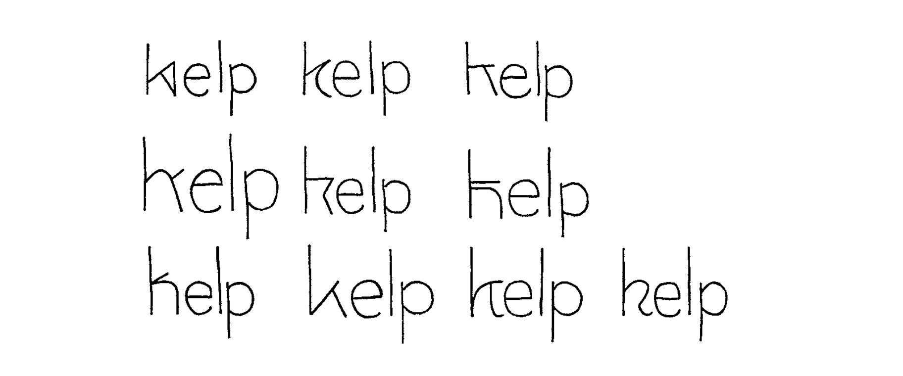
Hofstadter argues that an accordingly *spirited* conception of type design would therefore renounce Knuth’s ur-A-FORM in favor of a yet-higher- level abstraction, an ur-A-ESSENCE; the fundamental difference being that Hofstadter’s notion of “intelligence”extends beyond a Platonic shape, allowing for the concept of *what constitutes an A* to change, too — beyond what we can reasonably conceive of this possibly being in the future. Each new instance of an A adds to our general understanding of this idea (and ideal), which is necessarily assembled backwards over time.
Hofstadter includes this illustration of two letters vying for the same “typographic niche,” to make himself clear:
Continues in class ...
The article is a performative account of his intervening attempts, using MetaFont to harness the essential “intelligence” of letterforms. In Knuth’s view, the way a single letter is drawn—an a priori A, say—presupposes and informs all other letters in the same font. This information can be isolated, turned into a set of instructions, and put to work computer-auto- mating the generation of new characters by filling in the features between two or more variables such as weight or slant.
Such intelligence is (and has always been) implicit in any typeface, but Knuth is out to omit all ambiguity and install a more definite system. He acknowledges that this preoccupation with designing meta-level instructions rather than the fonts themselves is typical of the contemporary inclination to view things “from the outside, at a more abstract level, with what we feel is a more mature understanding.” From this elevated vantage, MetaFont was set up to oversee
how the letters would change in different circumstances.
A year later, fellow mathematician Douglas Hofstadter responded with his “MetaFont, Metamathematics, and Metaphysics” (Autumn 1982). While “charmed” by Knuth’s thesis, and admitting the bias of his own interests in artificial intelligence and aesthetic theory, Hofstadter proceeds to shoot down his colleague’s apparent claim that the shape of any given letterform is “mathematically containable.”To support his case, he invokes mathematician Kurt Gödel’s Incompleteness Theorems, which assert that any account of a logically coherent system always contains one root-level instance that cannot itself be contained by that account. Hofstadter’s antithesis then usefully couches the debate in terms of “the letter of the law” versus “the spirit of the law,” a familiar antinomy that posits an absolute deference to a set of set rules against a consistent-yet-fluid set of principles. Our prevailing legal system is, of course, based on both: judges base their decisions on firmly established precedent, but also map uncharted territory by bringing the full range of their experience to bear Knuth's "The Concept of a Meta-Font" , Visible Language, 16:4 (1982:Autumn) p.309 on specific cases “in a remarkably fluid way.” In this manner, the law itself adapts.
Hofstadter argues that an accordingly *spirited* conception of type design would therefore renounce Knuth’s ur-A-FORM in favor of a yet-higher- level abstraction, an ur-A-ESSENCE; the fundamental difference being that Hofstadter’s notion of “intelligence”extends beyond a Platonic shape, allowing for the concept of *what constitutes an A* to change, too — beyond what we can reasonably conceive of this possibly being in the future. Each new instance of an A adds to our general understanding of this idea (and ideal), which is necessarily assembled backwards over time.
Hofstadter includes this illustration of two letters vying for the same “typographic niche,” to make himself clear:
Continues in class ...
February 15, 2021
The meta problem
Readings
Letter-&-Spirit.pdf (Dexter Sinister)
The-Concept-of-a-Meta-font.pdf (Donald Knuth)
Metafont-Metamathematics-and-Metaphysics.pdf (Douglas Hofstadter)
Resources
Letter & Spirit (video)
The meta problem
Readings
Letter-&-Spirit.pdf (Dexter Sinister)
The-Concept-of-a-Meta-font.pdf (Donald Knuth)
Metafont-Metamathematics-and-Metaphysics.pdf (Douglas Hofstadter)
Resources
Letter & Spirit (video)